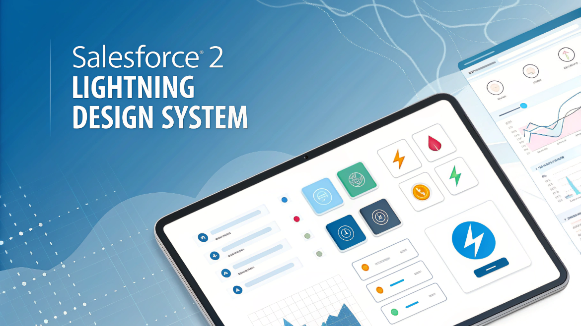
Exploring the Salesforce Lightning Design System (SLDS) 2.0:
In the world of modern web development, consistency, usability, and design efficiency are more crucial than ever. Salesforce, one of the leading CRM platforms, has been pushing the boundaries of user interface (UI) design with its Lightning Design System (SLDS). This design framework aims to provide a consistent look and feel across Salesforce applications while offering developers the tools needed to create engaging and scalable user experiences.
In 2025, Salesforce introduced SLDS 2.0, a significant update that further refines and enhances the design system’s power. This new iteration is packed with improvements that make it easier for designers and developers to create polished, intuitive interfaces without compromising flexibility. Whether you’re just starting with SLDS or looking to dive deeper into its newest features, this blog post will give you a comprehensive breakdown of what Salesforce Lightning Design System 2.0 is all about.
Key Features of SLDS 2.0
The second iteration of SLDS brings several new features and improvements that enhance the developer experience and help create an even more polished interface. Let’s break down some of the most important updates in SLDS 2.0.
1. Component Library Expansion
One of the most important changes in SLDS 2.0 is the expansion of its component library. In this new version, Salesforce has added several new pre-built components that adhere to its design principles. Some of the newly introduced components include:
- Dynamic Forms: With this feature, developers can create forms that respond to user actions, streamlining workflows and improving the user experience.
- Actionable Chips: A chip is a compact element that can represent a tag, item, or object. Actionable chips, added in SLDS 2.0, allow developers to create chips that users can interact with directly (such as clicking or removing).
- Popovers and Tooltips: These interactive elements can be added easily to provide helpful tips, enhance user understanding, and reduce confusion without cluttering the interface.
Alongside these, SLDS 2.0 includes refinements to existing components like buttons, modals, tables, and accordions, ensuring they follow the latest trends in user experience design.
2. Improved Customization with CSS Variables
SLDS 2.0 introduces CSS Variables to offer developers more flexibility in customizing the design system. With this feature, developers can adjust the core styles of SLDS components to fit the unique branding of their organization. For example, developers can now more easily update the primary brand color, typography, and spacing for a custom look that still adheres to SLDS standards.
This approach is more efficient than previous methods that required overriding styles in custom CSS files. Now, you can define your own variables to control colors, sizes, and other essential styles globally.
3. Dark Mode Support
As dark mode continues to rise in popularity, SLDS 2.0 now supports Dark Mode out of the box. Salesforce has ensured that its components and patterns look great in both light and dark modes, maintaining readability and accessibility no matter the theme.
This includes enhancements to icons, buttons, text, and backgrounds to ensure smooth transitions and high contrast for optimal user experience in dark mode settings.
4. Accessibility Improvements
SLDS 2.0 has been built with accessibility (a11y) in mind, ensuring that developers can create applications that are usable by everyone, including those with disabilities. Salesforce has invested a lot in improving the design system’s support for screen readers, keyboard navigation, and high-contrast settings.
Several components in SLDS 2.0 have been enhanced to meet the WCAG (Web Content Accessibility Guidelines) standards. This includes proper use of ARIA (Accessible Rich Internet Applications) labels, roles, and properties, which are now integrated into the system by default.
5. Enhanced Grid System
The grid system in SLDS 2.0 has also seen significant improvements. The flexbox-based layout approach introduced in SLDS 1.0 has been refined, and now developers have more control over column layouts, breakpoints, and alignment.
With responsive grid options, developers can ensure their interfaces work across various screen sizes, from mobile phones to desktops. This also makes the system more flexible when building custom applications that require dynamic layouts.
6. Icons and Illustrations
SLDS 2.0 includes a broader set of icons and illustrations that are consistent with Salesforce’s brand identity. These visual assets are designed to improve user interaction and navigation by clearly conveying meaning and making apps feel more engaging.
The icon library has been updated to align with new Salesforce product features and emerging design trends, allowing for a more cohesive and modern look throughout your application. Additionally, the illustrations now come in multiple styles, including both flat and 3D designs, making them more versatile for various use cases.
7. Design Tokens and Theming
Design Tokens allow for consistent theming and style management across large-scale Salesforce apps. SLDS 2.0 improves upon this by introducing a more granular approach to design tokens, such as colors, spacing, typography, and more. This feature enables easier theming and ensures that design decisions are consistent across the entire application.
8. Mobile-First Approach
SLDS 2.0 adopts a mobile-first approach to design. With the increasing reliance on mobile devices for accessing business applications, Salesforce recognizes the importance of delivering exceptional experiences on mobile screens. The updated system ensures that components, layouts, and interactions work seamlessly on smaller devices, offering a consistent and user-friendly experience across all screen sizes.
Benefits of Using SLDS 2.0
- Consistency: By using SLDS, developers can ensure their app interfaces align with Salesforce’s established design patterns. This results in a cohesive experience for users across Salesforce apps and custom solutions.
- Time-saving: SLDS 2.0 provides pre-built components and reusable design patterns, which reduces the amount of custom work needed. This can significantly speed up development and deliver faster time-to-market.
- Scalability: Whether you’re building a small app or a large enterprise solution, SLDS 2.0 scales seamlessly, allowing developers to design consistent UIs for apps of any size.
- Community Support: As part of Salesforce’s robust ecosystem, SLDS benefits from strong community support, with extensive documentation, tutorials, and forums.
Conclusion
Salesforce Lightning Design System 2.0 marks a significant evolution of the design framework, with new features that enhance flexibility, accessibility, and customization. By incorporating SLDS 2.0 into your development workflow, you’ll be able to create more polished, scalable, and user-friendly applications that align with the Salesforce ecosystem.
Whether you’re a developer, designer, or business user, understanding and utilizing SLDS 2.0 will help you build intuitive applications that delight users while maintaining consistency and ease of use across the Salesforce platform. The future of Salesforce application development is brighter with SLDS 2.0 at the heart of your design strategy!


There is apparently a lot to identify about this. I feel you made some good points in features also.